23 Jun Traditional Style, Modern Functionality – In Progress
In an earlier post, we shared the design process for a beautiful 1940’s colonial style house located in Jamaica Plain. Since then, we had the opportunity to help turn that design dream into a reality. Check out the progression below as this project came to life.

From the very first walk-through, it was evident that we needed to make the space feel brighter, more open, and more connected to the rest of the home.
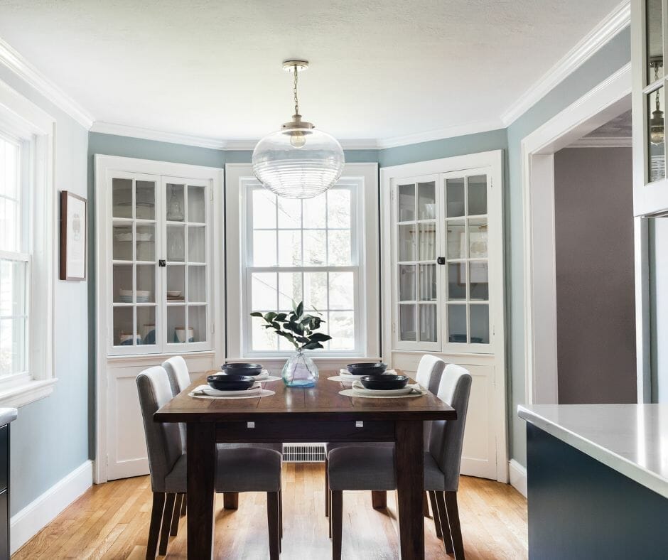
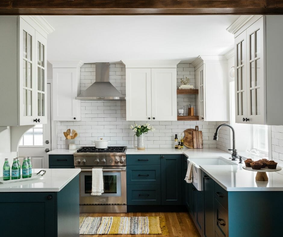
Despite the wall between the kitchen and dining room being a load-bearing structural wall, we determined that it was well worth the logistics of recessing the support into the ceiling. Not only did this allow us to accomplish our goal of a more open floor plan, it also allowed us to extend the kitchen countertops by more than a foot adding some much needed functional workspace to the kitchen. Even though we removed the wall to create a more open floor plan, we wanted to ensure the dining room retained distinction as its own space from the kitchen, enter: the decorative beam. This beam is not structural component, but visually it creates a clear transition from one room to the next. Not to mention it had the perfect touch of warmth & charm to make it feel like it was always meant to be there.8
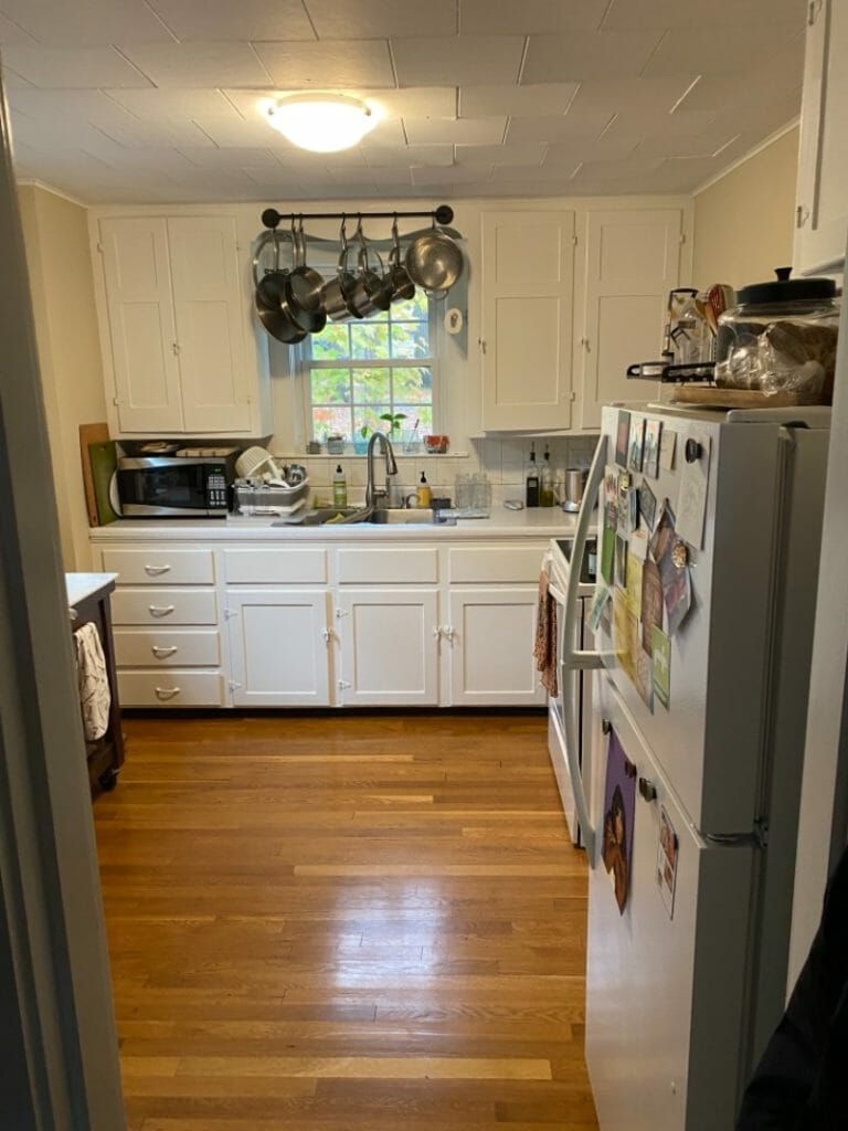
The Kitchen - Before

The Kitchen - After

To add even more light to the space, we replaced the existing window over the sink with a much larger window unit that featured a deep sill. In a contemporary rendition on the box window, we planned the height with precision to allow the windowsill to actually be an extension of the countertop material. It brings excellent light into the space, and is the perfect spot for a bit of greenery – even a little indoor herb garden.
The priority in this kitchen was to maximize the space that we had and that means that every little detail counts. From selecting a custom cabinet color which complimented the dining room wall color, to maximizing the functional food prep space on the countertop, even the bespoke edge detailing on the stone window sill and hutch backsplash, the design details make this brand new kitchen feel like it blends seamlessly with the history of the house.


